The artwork will outlive its author. This is the hope of every artist, at least. And while not every work of art will achieve the self-actualization that either changing tastes, public affection, or the art market can provide—enabling paintings, sculptures, and the odd urinal to pass through a succession of either genuinely appreciative or merely speculative hands—this conceit can serve as a subliminal encouragement for the artist in the creative act. It is curious to consider that Isamu Noguchi, who for the first few decades of his career epitomized the “artist’s artist” as an avant-garde sculptor with few sales but a keen grasp of the advantages of media exposure, saw a route for himself as a creator of site-specific works to bypass the conventional trajectory of the studio artist. His conception of the “sculpture of space” as a platform to work beyond a traditional perception of movable/stand-alone sculpture would lead to a reputation as a sculptor and collaborator with an understanding of how sculpture could exist on architecture’s terms.

Photos: Miguel de Guzmán. ©INFGM / ARS
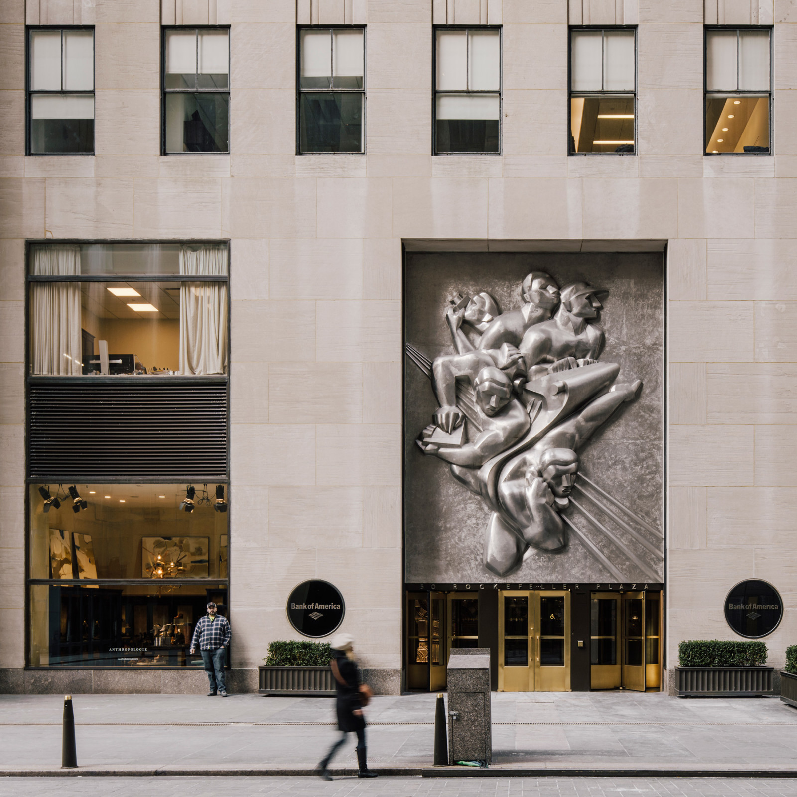
Beginning with his first successful public commissions, History Mexico at the Mercado Abelardo Rodríguez in Mexico City (1935) and his frieze News at the Associated Press Building in Rockefeller Center in midtown New York (1938–39), Noguchi began to consistently spend as much time (if not more) on site-specific projects integrating sculpture into space as he would on his studio work. The drawback, however, was that he was treading into undefined territory, with some discouraging results. His positivist and utopian objectives at mid-century had not yet fully grappled with the unsentimental nature of capitalist terrains and eminent domain. His struggle to see a concept move from sketch to ribbon-cutting had not yet been reconciled with the necessary assurances and guarantees for the practical upkeep of public sculpture. And he had not taken into account the effects a sustained indifference or the occasional public outcry might have in undoing the enduring.
The lesson Noguchi learned from these experiences probably laid the conceptual foundation for his namesake museum: in purchasing, building, and leaving an endowment to look after The Noguchi Museum, he could at least control the fate of some of his work.


Comprising a little-known project, the Noguchi-designed interior details for a new lobby of the Time & Life office at One Rockefeller Center were unveiled in 1944. In the early 1940s, executives at Time & Life decided that the company needed a street-level presence at its headquarters and engaged the architecture firm of Harrison, Fouilhoux & Abramovitz to create it. Noguchi came to know Wallace K. Harrison through a commission for the frieze News for the Associated Press Building at Rockefeller Center in the late 1930s, as well as through a few other projects, including a unique wood table for the house Harrison built in Maine for Museum of Modern Art trustee William A.M. Burden.
The lobby at the Time & Life Building was dubbed an “information center”—a space where visitors could peruse the latest issues of Time & Life’s various publications or ask receptionists for tourism tips. Noguchi worked alongside two other designers (Minoru Yamasaki and Ann Hatfield), and the full extent of his contribution is unknown. A combination of scenographic elements centered on the ceiling above the main reception desk, dominated by an illuminated sculpture in plaster, is confirmed to be Noguchi’s work. As with another interior commission from the period, the American Stove Company–Magic Chef Building in Kansas City, Missouri, Noguchi’s ceiling design featured long tapering channels, alternately exposed and concealed along their lengths and lit within the recesses. Three 13-foot-diameter circular photo murals of maps were lit by spotlights whose housings, designed by Noguchi, were described by the attendants as “the molars.”1(Similarly, a three-legged coffee table with a molar-like appearance that stood in the space is assumed to be another element by Noguchi.)
By 1947, Time & Life made plans to acquire property to build a larger headquarters for its expanding empire. During what would be a slow process, Noguchi’s illuminated ceiling survived the lobby’s renovation in 1952. The company would relocate to a new building in 1959, with the expansion of Rockefeller Center, at 1271 Avenue of the Americas between 50th and 51st Streets. MK


In 1947, Noguchi was commissioned by the designer Donald Deskey to create a work for a stairwell on a passenger ship, the SS Argentina. Formerly known as the SS Pennsylvania, the ship was purchased by the U.S. Maritime Commission in 1937 as part of President Roosevelt’s “Good Neighbor Fleet” initiative to represent U.S. goodwill by offering service to South America. Rechristened the SS Argentina and operated by Moore-McCormick, the vessel made trips to Buenos Aires.
Deskey’s task was a maiden voyage in itself: he selected seven painters and sculptors to upend the staid atmosphere of the conventional cruise ship as well as to free modern art from the confines of the museum where it was typically encountered. Critical reception in architectural and design magazines leaned negative.
Noguchi’s design was an expansive takeoff from his experiments with magnesite “lunars” during the 1940s, in this case featuring a wall resembling a desert surface with “self-illuminating light.” The wall’s topography, known only through three surviving photographs, featured inscribed channels, nodules, mounds, and concave depressions dramatically accentuated through the use of inset lights. Lunar Voyage was short-lived, as the SS Argentina was dismantled in 1958. MK


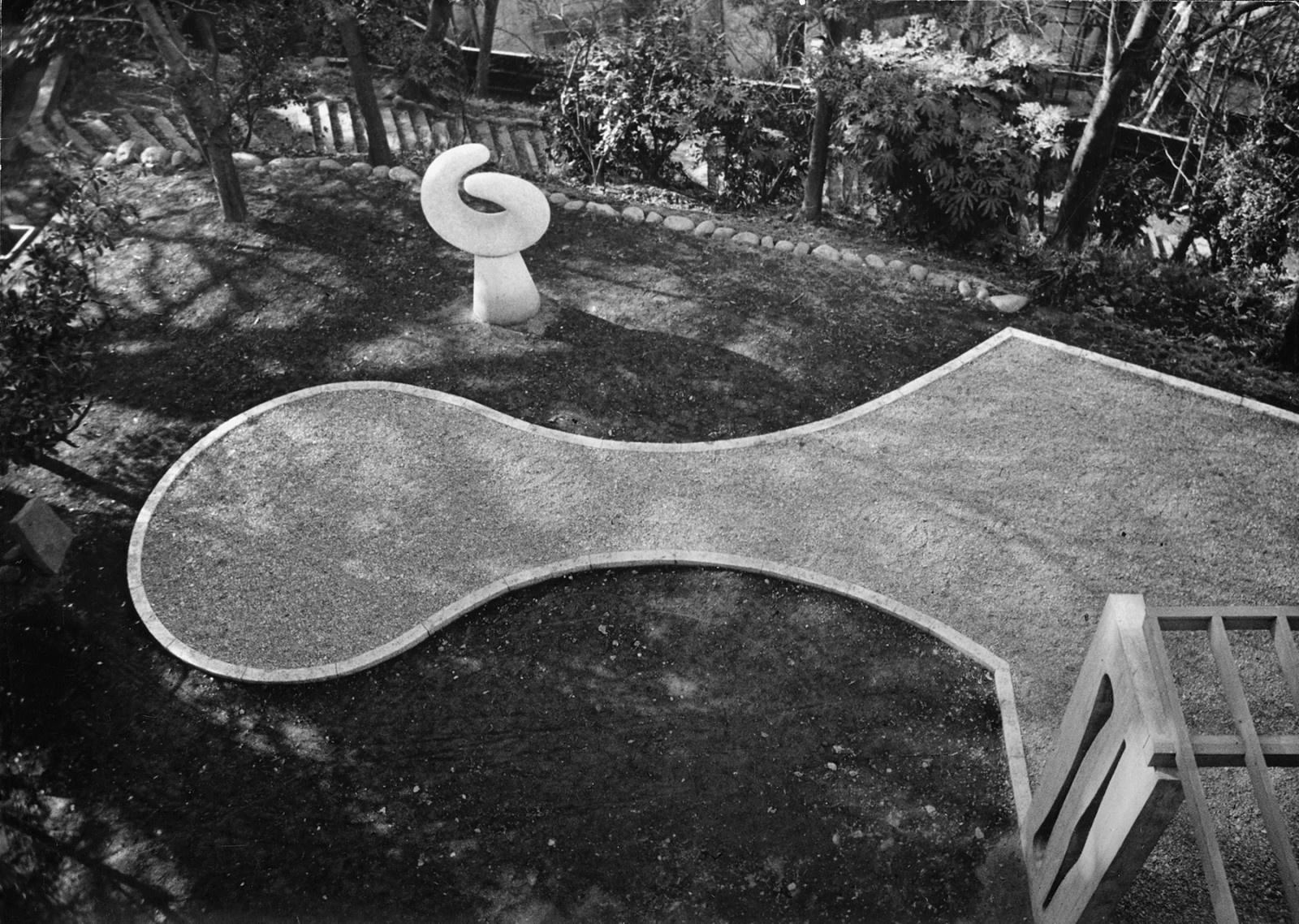
When he approached Noguchi to design a garden for his Reader’s Digest Building in Tokyo in 1951, the architect Antonin Raymond bluntly admitted that he had little budget to compensate the artist for his work. Yet Noguchi eagerly accepted the $1,000 commission, finally realizing his ambitions of working on his first landscape design after two decades of thwarted attempts.
Noguchi drew on his then-coalescing studies of the Japanese garden tradition to soften and complement the linear formality of Raymond’s International-style headquarters. With a small crew of workmen, Noguchi set about shaping hills and digging ponds and channels on the compact campus, placing a 20-foot-tall, wrought-iron skeletal fountain (partially inspired by the fire towers he saw in Tokyo) at the center of the largest pool. The long pond and fountain were included ostensibly to take advantage of the overflow from a subsurface hot spring below Tokyo that Raymond tapped to heat the building. It was also Noguchi’s first attempt at siting stone as an accent, although probably not under ideal conditions, as his budget precluded him from using the pedigreed Japanese stones that were up to his standard. Instead, stones were dug up from the property and repurposed. One sculptural feature—a “strawberry mountain, a rock pile with strawberries growing between”2—sat at the entrance of the driveway.
While Raymond’s building is held up as an important example of mid-century architecture in Japan, its reputation could not ensure its survival nor that of Noguchi’s garden: the building was demolished and the site was razed less than ten years after Noguchi completed his work. The iron fountain now resides at Macalester College in Minnesota. MK

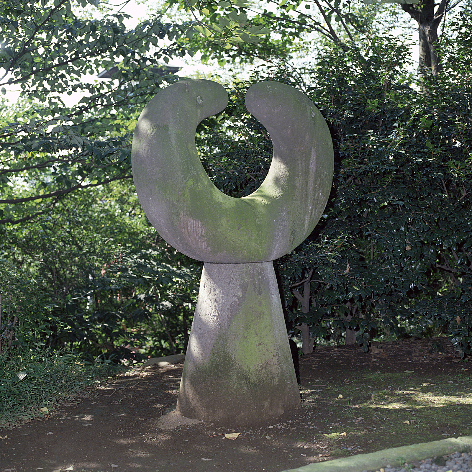
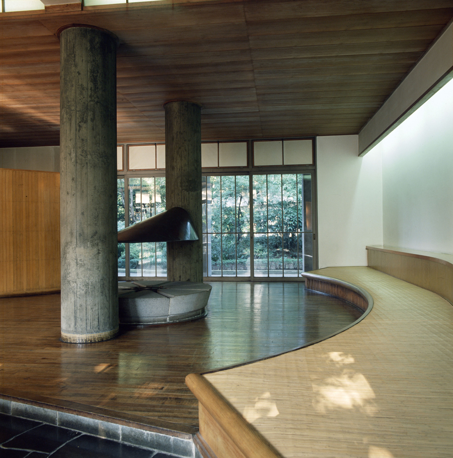
A singularly important moment of closure on Noguchi’s return to Japan in 1950 was his design of the common space at Keio University that he dedicated to his father, Yonejiro Noguchi, a member of the university’s faculty until World War II. The building was named Shin Banraisha (New Building for Many Guests) by the architect Yoshiro Taniguchi (father of Yoshio Taniguchi) as a symbolic and conceptual gesture toward Japan’s reentry into the world after the war.
Taniguchi commissioned Noguchi to create a holistic space blending a multipurpose room with a garden. The interior featured a tokonoma (alcove) that could be used for displays, performance, or oration; a hearth space implying a shared tea ritual; and a seating area with cane and rattan benches scaled especially to the space. Outside, Noguchi dotted the garden with sculptural accents that included a welded iron tower, Student; an interlocking sculpture, Wakai Hito (Young Man); and a standing sandstone column with a mudra-like aperture, Mu (Nothingness).
In the early 2000s, however, the University’s trustees ruled to have Taniguchi’s building removed to make way for a law school. Although there was some outcry from Noguchi’s advocates in Japan, the plan advanced and architects devised a solution to have Noguchi’s lounge dismantled and reassembled within a shell space at the top of the building, delineating walls with sheer, see-through curtains to give some sense of the original space. A terrace was substituted for the garden, while the sculptural accents Mu and Student were separated and scattered throughout adjacent buildings. The unity between interior and garden that Taniguchi and Noguchi had strived for, however, was entirely disrupted. MK


Playing against formal elements and even exaggerating or amplifying dichotomies was a typical trick in Noguchi’s playbook. When Noguchi was commissioned to create a site-specific work for a remodeled Bank of Tokyo lobby in lower Manhattan’s financial district, he solved the aesthetic challenge presented by highly ornate, neoclassical columns, moldings, and a coffered ceiling by suspending a sleek, metallic chevron-like form from the four columns, partly in reference to his Red Cube, which he had installed a few blocks away at the Marine Midland Bank in 1968.3
Made from folded aluminum, in this new work, Shinto, Noguchi exploited the weightlessness of the material to conjure a looming 17-foot form, giving a sense of implied weight, while leaving the lobby floor below clear. The formal dichotomy was lost on the bank’s customers, however: bank executives would later acknowledge the complaints of their customers, who found Shinto to be a vaguely threatening presence (“guillotine” was one description of it).
Despite a glowing review from New York Times architecture critic Ada Louise Huxtable at the time of its unveiling, bank executives had not warmed to the sculpture either. Shinto was removed and dismantled in 1980 without bank executives alerting either Noguchi or the supervising architect of the renovation about its removal. Since the sculpture was made of a single piece of aluminum, it had to be cut in pieces for relocation. When a private collector later purchased the aluminum and approached Noguchi about the work, the artist was unequivocal: once removed from its intended setting, Shinto had lost its intended function and meaning, rendering it purposeless. The episode earned some media coverage, sparking debate in arts magazines and presaging the controversy surrounding the removal of Richard Serra’s Tilted Arc from Foley Square nearly a decade later. MK


In 1955 Robert Carson of Carson & Lundin approached Noguchi about repurposing an unrealized wall design for a bank lobby in Texas for a new office building Carson was designing for The Tishman Company, across the street from the Museum of Modern Art, in New York City. Noguchi agreed to reconceive the wall relief as a ceiling for 666 Fifth Avenue, on the condition that he also be allowed to make a waterfall. Carson and Tishman agreed, and the building opened with Noguchi’s ceiling and waterfall in 1957.
In earlier interiors Noguchi had employed magnesite and reflected light to produce smoothly contoured landscapes closely related to his concepts for earthworks, as in Interior for Time & Life Building, New York, 1944, destroyed; Lunar Voyage, SS Argentina, 1947, destroyed; and Ceiling for Magic Chef Building, St. Louis, 1948. Here, he used his interlocking sculpture technique with ranks of steel and aluminum louvers (slats) creating topographical illusions that shifted with the viewer’s position. The ceiling and waterfall transformed a rather harsh, cold, low-ceilinged matrix of marble clad hallways into a surprisingly whimsical, semi-organic environment, with sound from the waterfall naturalizing traffic noise from the street and the filtered light and undulating shape of the ceiling creating an infinite “landscape of clouds.”4
Between 1957 and 2018, the building changed hands several times, with each change producing substantial alterations to the lobby. More than once The Noguchi Foundation was able to prevent the complete removal of the works, but at the expense of Noguchi’s original vision. The changes that proved most damaging to Noguchi’s environmental situation were: the closure of the Fifth Avenue entrance, which made the waterfall difficult to see and robbed it of any connection to the street; the replacement of the interior surfaces with generic wood and granite, which destroyed the contrast between the hermetic topology of the geometric architecture and decoration and Noguchi’s infinite horizon landscape additions; and the deactivation of the waterfall.
In the fall of 2020, Noguchi’s work was permanently removed as part of a complete renovation of the building. The components were donated to The Isamu Noguchi Foundation and Garden Museum, which has begun a process to consider how it might be given a new life in the public sphere. DH


After two separate plans for a garden court failed to be incorporated into the headquarters for Lever Brothers in New York designed by Skidmore, Owings & Merrill (SOM), Gordon Bunshaft of SOM approached Noguchi for another commission at Connecticut General Life Insurance Company in Bloomfield, Connecticut. Noguchi was tasked with conceiving a unified program within the four pocket courtyards created by the crisscrossed corridors that defined SOM’s rectangular three-story building, along with a side terrace on the south side that would contain a sculptural ensemble.
In contrast with the modeled grounds of the Reader’s Digest Building in Tokyo, each of these courtyards was a level plane, on which Noguchi placed a combination of beds of gravel interleaved with undulating patches of lawn, plantings, and a dominating, elliptical bench of granite in one courtyard, as well as shallow reflecting pools with stepping stones and vertical stone elements as accents. Originally intended for the entrance court, three sculptures of Stony Creek granite were enlarged in scale after Noguchi found them to be problematic in one of his preparatory models, and it was decided to move the group, called The Family, to the surrounding property. Its placement at a distance from the building was intended to activate certain viewing points from within the building.
By 2000, CIGNA (the descendent of Connecticut General) had razed a second building on the campus (another SOM building, the Emhart) and began to parcel the surrounding land for a golf course and a housing development. The loss of a pond and the interference of new landscaping and golf course trappings left The Family adrift and isolated from its intended relationship with the campus buildings. Architectural preservation groups, which considered the grounds as the predecessor to the corporate campuses of the following decades, attempted to halt changes to Connecticut General but faced something of an uphill battle since this was a private commission. Noguchi’s suburban collaborations with SOM for Connecticut General and also for IBM’s headquarters in Armonk, New York, exist in relative obscurity—publicized in architectural magazines upon their initial completion, but largely unknown even within the landscape architecture field. MK
Text by Matthew Kirsch, Curator and Director of Research, and Dakin Hart, Senior Curator from 2013–23, at The Noguchi Museum.
Produced by Alex Miller.
Transcripts of archival materials are available by request to accessibility@noguchi.org.
1 “No More Shirts” (Talk of the Town), New Yorker, December 2, 1944, 24.
2 Isamu Noguchi, “1949,” typescript, undated (probably c. 1983), The Noguchi Museum Archives, MS_WRI_008_001: 18.
3 Transcription of interview with Bruce Bassett, August 25, 1978, The Noguchi Museum Archives, MS_WRI_049_005: 10.
4 Isamu Noguchi, A Sculptor’s World, New York: Harper & Row, 1968, 165.
